There are some fonts which just don’t look good in print or are now out of fashion – follow our guide to avoiding certain fonts and your next print project will look much better.
Here are the fonts to avoid.
Times New Roman
First used by the newspaper industry for printing legibly on poor quality paper, this typeface is certainly easy to read. It has stood the test of time for some purposes, but not print design. For marketing purposes, it looks old fashioned and stuffy.
Comic Sans
One of the most overused fonts, Comic Sans became a popular choice for its light-hearted appearance. However, it’s been used so often that it’s no longer effective, and has become a joke in the print and design world. Use Comic Sans at your own risk, as most people won’t take you seriously.
Papyrus
Papyrus isn’t a terrible typeface in its own right, but it is significantly overused and synonymous with certain types of businesses. Papyrus now lacks originality, as it’s been chosen for too many “rustic” or “holistic” eco-friendly businesses.
Curlz MT
Artistic and whimsical, Curlz MT is unfortunately also difficult to read. That illegibility, however, doesn’t stop people from using it. Curlz MT has become synonymous with overused fonts, and isn’t suitable for anything more than a child’s party invitation.
Bleeding Cowboys
One of the more recent additions to the growing list of overused fonts, Bleeding Cowboys has already worn out its welcome with printers and designers. Described by some as “nauseating,” it makes an attempt to be original, but instead is too gaudy and difficult to read.
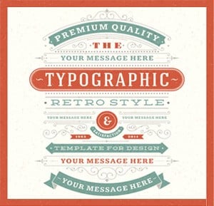
Brush Script
Brush Script, in addition to being amongst commonly overused fonts, is also quite outdated. Popular amongst older North American tourist brochures and on local sports teams’ uniforms, it no longer stands out or makes a positive impact on readers.
Impact
As the name suggested, this typeface was designed to make an impact. However, the only place it’s useful anymore is creating internet memes. Impact has featured on numerous billboard and poster adverts, looks like it was created with Microsoft Word Art and is no longer effective for marketing.
Kristen ITC
Too cute, much like overused fonts Curlz MT and Comic Sans, Kristen ITC doesn’t elicit respect. While some mistake it as fun and playful, there are very few instances where this font or others like it are a wise choice for your print marketing.
Selecting the wrong font can put potential customers off using your business and therefore harm your response rates. Use a professional designer who understands typography and this will make people more attracted to what you have to say.
The next time you go to design a print project, whether business cards or leaflets, carefully consider what fonts you choose and how they’re laid out and you will improve the response you get.