Researchers have pinpointed the world’s ugliest colour, and it’s been lovingly described as “dirty”, “tar”, and even “death”, just to name a few associations.
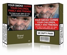
Pantone 448C, also called opaque couché, may get a raw deal, but this sewage-tinged hue actually has an important mission as experts chose the green-brown shade to discourage smoking.
After early success in curbing cigarette sales in Australia, the UK has followed and developed plainer cigarette packaging using Pantone 448C. Every carton had to look as unappealing as possible.

Given that our moods change, and colours play a role in how we feel, it’s important to understand the importance of which colours work best for which purpose.
So, despite opaque couché getting a better reputation for all the lives it could possibly help save, it might be wise to avoid using it in your marketing.
If you want a good response to your marketing, let our expert design team come up with a colour palette that will attract rather than repel.
After all, we are Dedicated To Response!


